Archive for February, 2007

New York, New York

Posted by Arlo on Feb 8, 2007 under Thought Objects

Click for full sizeLately I’ve been thinking a lot about New York — I don’t know why — but it got to the point where I decided to jot down some ideas.  (If you haven’t noticed, I tend to write as a way of forcing myself to organize my thoughts.  What other post-high school reason is there to write essays?)  I’ve been trying to wrap my head around an elusive theme, and recently, a few happenings began lend it clarity:

  1. 1. My writing on the Alaskan mystique started an internal process of comparing and contrasting the same with New York City.
  2. 2. At dinner last week, my friend, Mike, related the story of how one of his friends referred to New York City as, simply, The City.
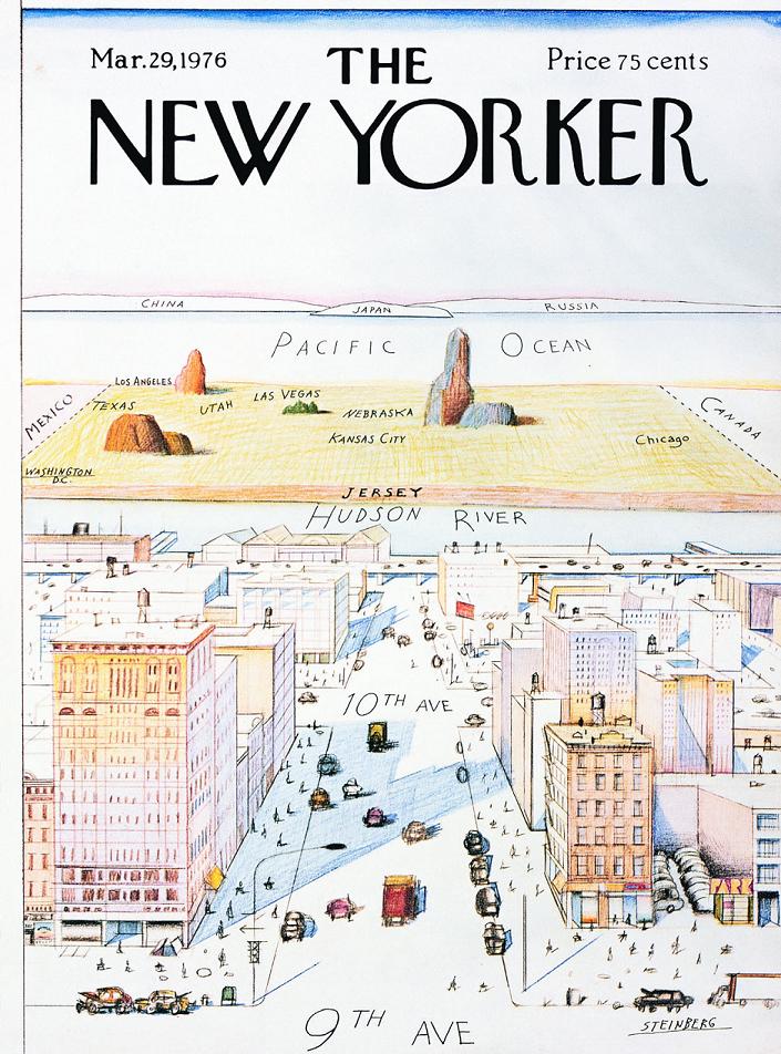
  3. 3. A perfectly ego-centric, 1976 “map” of New York was posted yesterday on Strange Maps

I find New York City, or rather the perception of New York City, very interesting.  In our media-rich culture, New York is everywhere.  Any number of movies — Spider-man, Ghostbusters, King Kong, Taxi Driver, to name a few — couldn’t be set in a different city.  There’s a peek into New York almost every night on any number television shows:  Law & Order, Friends reruns, The Apprentice, and, of course, CSI: New York.  Sex and the City pretty much makes The City a supporting character.  Dominos Pizza gives us a glimpse of New York culture with commercials touting their new Brooklyn Style Pizza.  Even popular websites like Kottke.org nonchalantly mention New York City.

That New York is on our consciousness isn’t impressive.  Sure, it’s a big, important American City; I get that.  What interests me is the matter-of-fact way in which it’s presented.

New York City is served up to us by New Yorkers, and to New Yorkers the city is forefront in their daily lives.  That’s understandable.  I can imagine that living in a city that big would have an impact on your life.  Here’s the thing, though:  By virtue of it’s media-onslaught, even though I’ve never been there¹, New York has an impact on my life, too.

Read the rest of this entry »

Inside Joke

Posted by Arlo on Feb 5, 2007 under Thought Objects

You see, a gamut is another word for a color space... oh, nevermind.Despite subscribing to the updates on Jane Espenson’s blog, I don’t really enjoy reading it.  It’s mostly about writing spec scripts and what she had for lunch (what’s up with that?)  The entries are short, however, and every once in awhile I pick up a worthwhile writing tip.  Besides, she’s written episodes for some of my favorite TV series (Battlestar Galactica, Buffy the Vampire Slayer, Angel, Firefly, and Star Trek: Deep Space Nine), so that’s interesting.

Last week she discussed the defining characteristics of high-brow and low-brow jokes.  High-brow jokes are ones that normally only high society types would understand.  She demonstrated a joke she’d seen on Frasier.  It was based on an opera I’d never heard of, Menotti’s Amahl and the Night Visitors

And then, of course, on the ride home that night I caught an entire NPR segment on Menotti.  I always wonder if things like that are coincidences or if they’re going on all around me and I’m just not tuned into them.  Had I heard of Menotti’s opera before the one-two punch of blog-radio that day?  Maybe I don’t remember because it wasn’t on my radar.  No way to know.

– Low-brow jokes, on the other hand, appeal to a different class of people.  She does a good job of deconstructing high- vs. low-brow.  I never really stopped to consider that the distinction has nothing to do with whether the joke is good or bad, smart or dumb.  The dividing line has to do with socio-economic boundaries.  I inferred from her writing that a good joke, high-brow or low, probably shouldn’t even be understood by the opposite group.

Read the rest of this entry »

Caution: Wet Paint!

Posted by Arlo on Feb 2, 2007 under Photography

Caution: Wet Paint

A little more than a year ago, our department decided to spruce up the office with an art project.  We decided on collaborative Jackson Pollock style painting.

Our canvas, once stretched, turned out to be around 6′ x 6′.  One fine fall day, we took it out on the deck, laid it down on a plastic drop-cloth, and cracked open many undesired cans of paint.

I didn’t actually take part in the painting; I was there with my camera, documenting the process.  It was a slow start.  As people experimented with the paint — dripping it, pouring it, splattering it — the white background disappeared slowly.  Too slowly, in fact.  There were some great early splatter patterns that were covered over completely as the paint was layered on enough to cover the canvas from frame-edge to frame-edge.  At one point, I worried that the whole Pollockness of the painting would be ruined as the most enthusiastic painters used their hands to smear the colors into an almost uniform shade of greenish-brown.  I shouldn’t have worried.  They were simply coating the canvas for the next few dozen layers of paint.

Most of the shots I took that day are dynamic:  People flinging and spattering paint, posing with dripping orange hands.  Surprisingly, my favorite shots happened to be of the artwork itself.  At the end of the session, before the paint was dry, I crawled all around the canvas, trying to find interesting angles from which to take a picture.

In choosing the photo for my website, I grudgingly eliminated three others that I really liked.  One had amazing glossy highlights that showcased the texture of the layered paint.  Another had great depth of field.  Two of them showed the sheer scale of the painting — the loops, squiggles, and drips are revealed to be quite complex.  But this one…  This one doesn’t have a lot of texture, almost no highlights, and just a bit of depth.  This one is about the color.

It only took a few days for the painting to dry, but we didn’t hang it up until months later.  I always felt a bit guilty about that; it was the longevity of my Post-It Note idea that monopolized the wall space…

Canon Digital Rebel XT
Date: 23 September 2005
Focal Length: 55mm
Shutter: 1/200 second
Aperture: F/5.6
ISO: 400
Photoshop: Negligible Auto Color adjustment