
A Midgett Blog, Volume I, 2003… Published!
This is so cool! I just received my blog-turned-book in the mail from Lulu.com! It turned out better than I’d dare to hope! Exclamation points should be reserved to represent forceful dialog, but who cares?!
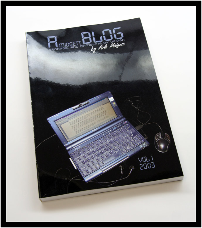
Seriously, though, A Midgett Blog, Volume I: 2003 has been published and I couldn’t be happier. It’s a 166-page, perfect-bound, 6″ x 9″ trade paperback. It’s somewhat of a hybrid between a full-size hardback and a mass-market paperback. I put so many hours into learning all the ins and outs of self-publishing and spent so much time designing the layout of the pages and the cover that I worried that I would be disillusioned by anything less than printing perfection. Even with heightened expectations, Lulu doesn’t disappoint.
Technically, I suppose you would have to say that this book is “printed,” rather than “published.” I looked into the two publishing options offered by Lulu: Published by Lulu and Published by You. In the former, Lulu will reserve an actual ISBN for your work, effectively listing it worldwide in every major bibliographic database. Walk into any bookstore, do a search on Amazon.com, and you’ll be able to order your book. With the Published by You option, you’d be listed as the publisher, which would be cool, but you would also have to go through the hassle of registering your own ISBN through the US ISBN Agency. Both options add at least $100 to the cost of printing. I decided to just print it. Who’s going to be looking for my blog at a bookstore?
Having a book “published,” with all the acceptance that the word implies, would certainly be something to be proud of. I would have thought I’d have experienced some niggling disappointment when I passed on the whole ISBN thing. Turns out, not even a little. I have an artifact now, a physical thing that sits on my bookshelf. For some reason, that’s just so much cooler than digital bits flitting around in cyberspace.
A single printing cost me about $30, which I don’t think is terrible considering that a book of this size would probably have a retail price of $15. The cost would drop all the way down to $8 or so if I were to print the interior pages in black and white. However, I wanted the freedom to color some of the text, not to mention keeping the original color photos. If I really wanted to pinch pennies, I could have reduced the number of pages by shrinking the font size of the body text style, too. Actually, I think the default font size came out a bit too large, anyway. A good thing, too, considering the rough draft of Volume II is clocking in at 450 pages ($72!).
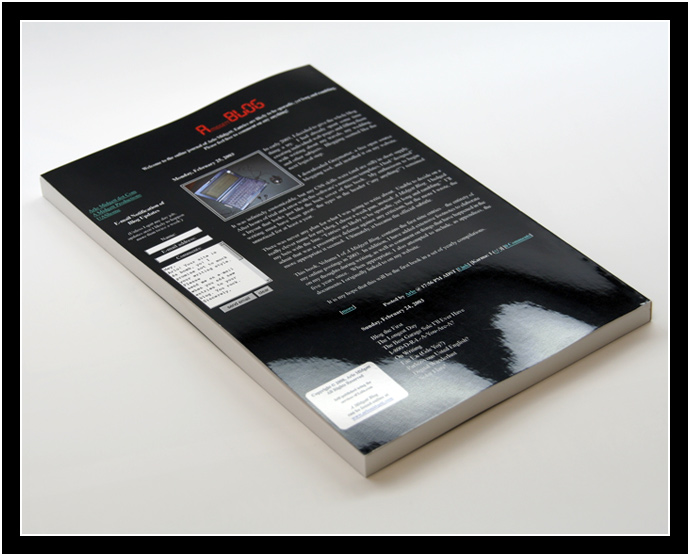
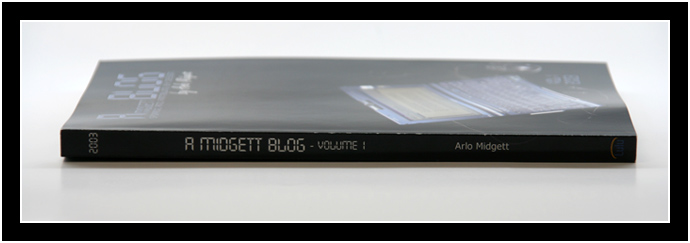
Besides the slightly large font, there’s not a lot I don’t like about my first printing. The glossy black cover attracts fingerprints, but I can live with that. The dark blue text box on the back cover doesn’t seem to be differentiated from the black background at all. The edge of the spine is worn down to white in a couple places, but I think that probably happened during shipping. I did notice one typographical error while flipping through the book, but I’m not about to proof-read the material yet again just to see if there are more. Easy fixes, if I decide to order another copy or two.
I would wager that I spent at least 100 hours working on this project. I started by doing one more editing pass on printed copies of my blog entries and their comments. After that, the majority of my time was spent in Word, setting up and tweaking styles, creating references, migrating from Office 2003 to 2007, and inserting the original images from old CD-R backups. I spent an inordinate amount of time trying to precisely conform to every one of Lulu’s suggestions: header /footer formatting, line spacing, page numbering, fonts, page sizes and margins, gutter width, photo placement, and cross referencing. Often times, making a single change to any one of those variables would affect my entire layout. Sometimes Word would throw up the craziest speed bumps (e.g., suppressing a single page number becomes a nightmare of footer/section changes – I finally hit on a cheat: Just hide the damn page number by slapping a white textbox over it.) One of the most frustrating habits of Word was that its two-page view was the exact opposite of the book’s two-page spread. I wanted every chapter to begin on the right page; Word would only ever show it on the left!
Towards the end, I spent almost as much time learning how to make a proper PDF file with Adobe Acrobat. No security settings, embed all fonts exactly once, flatten layers, compress pictures, save with Acrobat 4.0 compatibility, etc. Not exactly difficult, but not my idea of fun, either.
I should point out that my friend, Daniel, used Lulu to print a book back in December. He managed the entire process in about four hours by letting them convert his Word document to a PDF automatically. Of course, he didn’t mind only being restricted to using their half-dozen or so fonts, nor did he concern himself with a complicated layout…
Once my PDF was created, uploaded, converted, and downloaded again for quality assurance, I began working on the cover in Photoshop. At first, I could only stare at a blank document of very precise measurements (the number of pages in your manuscript dictates the width of the spine to the hundredths of an inch.) I had no idea what I was going to put on it; I was paralyzed by the possibilities. Searching for inspiration, I happened to check the Internet Archive’s Wayback Machine. As soon as I saw how crappy my website looked back in 2003, I had the uncontrollable urge to use its (terrible) design for the back cover. I realized I could even write a back-cover summary as if it were a blog entry.
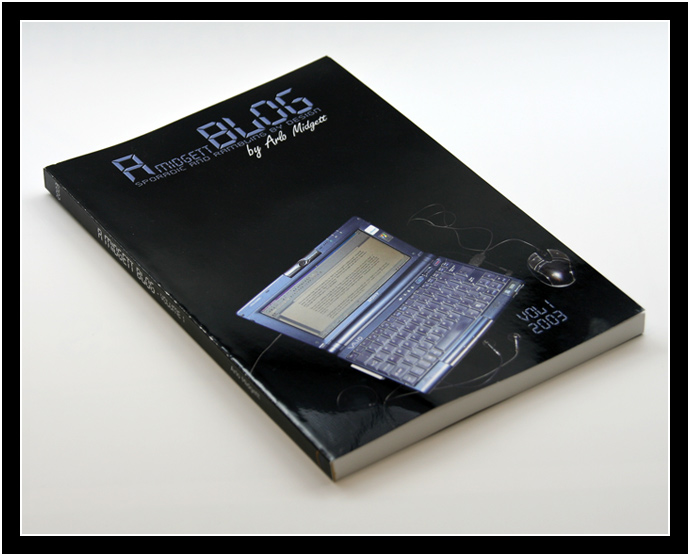
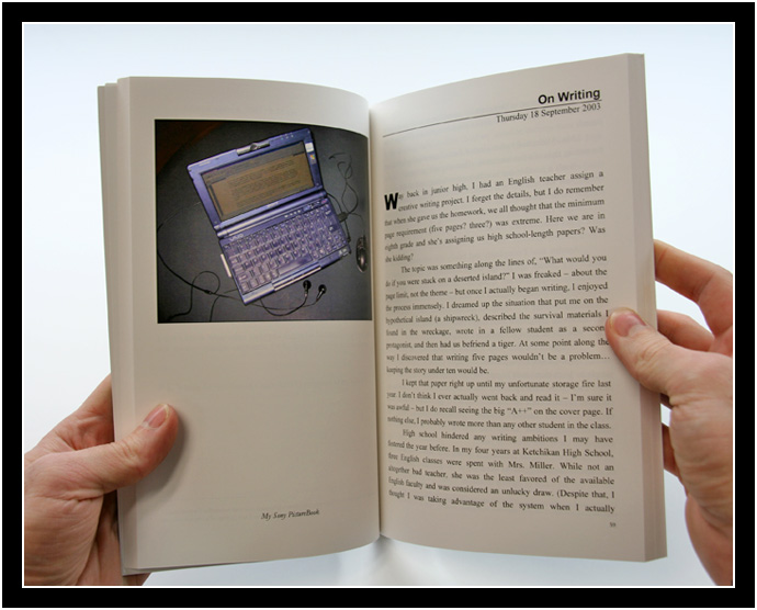
That gave me the black background and some fonts to work with, which helped to restrict ideas for the front cover. I decided to use a picture of the laptop upon which I had done most of the writing. It seemed to fit; the same image was also used in one of the blog entries in the book. I can’t claim the results are “good design,” but I like the way it turned out. I want the books to reflect the visual changes my blog goes through over the years. The back covers will practically design themselves, but I have no idea what I’ll put on the front. If anyone has any suggestions, I’m all ears. (I also think it’d be kind of cool to let someone else design the front covers.)
If anyone’s interested in giving me some feedback on the layout and design of Volume I, so that I might make improvements for Volume II, here are the PDF files that the book was created from: Cover (3.4 MB) and Manuscript (34.6 MB).
And if, for some reason, you actually want to buy a copy of a book chock-full of material that’s freely available online, we can probably work something out. I’m looking for a good excuse to convert my manuscript into one of Lulu’s hardback or mass-market paperback templates…
Congratulations Arlo!
The book looks really cool and the work you’ve put in creating it sounds really impressive. You’re on your way of becoming a self-publishing guru.
That’s really cool. It makes me wish I could read through my great grandparent’s blog archive. You’re leaving a fresh footprint.
That’s amazing. Let us know when the book signing is.
Ha! That looks awesome Arlo! You are always an inspiration when it comes to things like that. I can’t wait to see the final product, knowing how much time you’ve put into this. I’ll stop by Media and check it out.