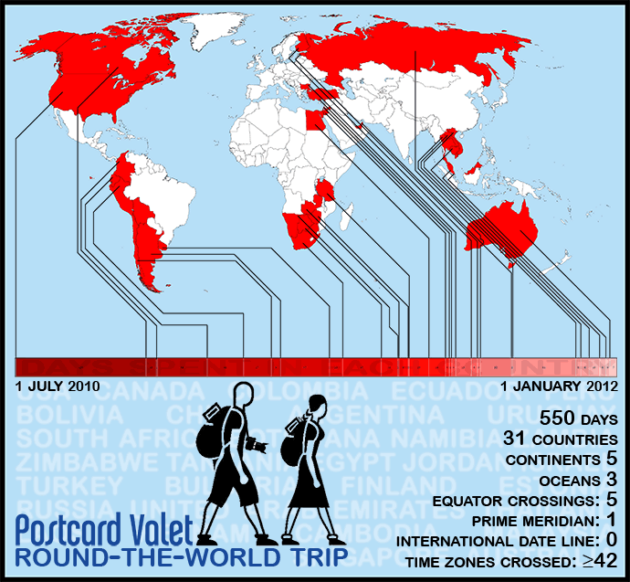
PV Infographic 1: Time and Place
Throughout our round-the-world travels, Oksana and I managed to record a whole lot of data pertaining to our trip. There were certain things we updated every single day (my journal, our travel budget, our GPS track) and some things that we recorded on a less frequent basis (number of buses, trains, planes, etc.) While it almost became too much to keep up with at the end of a year and a half — I’m still catching up on our GPS page! — we saw it through and now have a huge amount of raw data to examine. Personally, I find it fascinating to dig into this stuff and I can’t wait to see what it tells us!
- What was our least expensive country?
- How many photos did we take?
- How many miles did we cover?
- How many hours did we spend on buses?
- How much money did we spend?
On second thought, maybe I don’t want to know the answer to that last one…
In the coming weeks and months, as we parse this data for our own curiosity, I’ll be sharing it on our website. But looking at spreadsheets and numbers probably isn’t fun for you, so I’m going to do my best to present it in a way that’s easier to digest. I created this first infographic — which we tried to limit to simply time and place — with this in mind. Hopefully it’ll be the first of many.
Make sure you see the full-size version!


Very cool!
Congrats you guys, and looking forward to more posts and videos from your journey.
-DT